.png)
📍 Redesigning bigbasket's 'Add Address' journey
Overview
I worked on this while I was leading a project called “Growth Key Improvements” within bigbasket. bigbasket is India’s leading and one of the first online grocery delivery app with millions of customers across 50+ cities.
Context
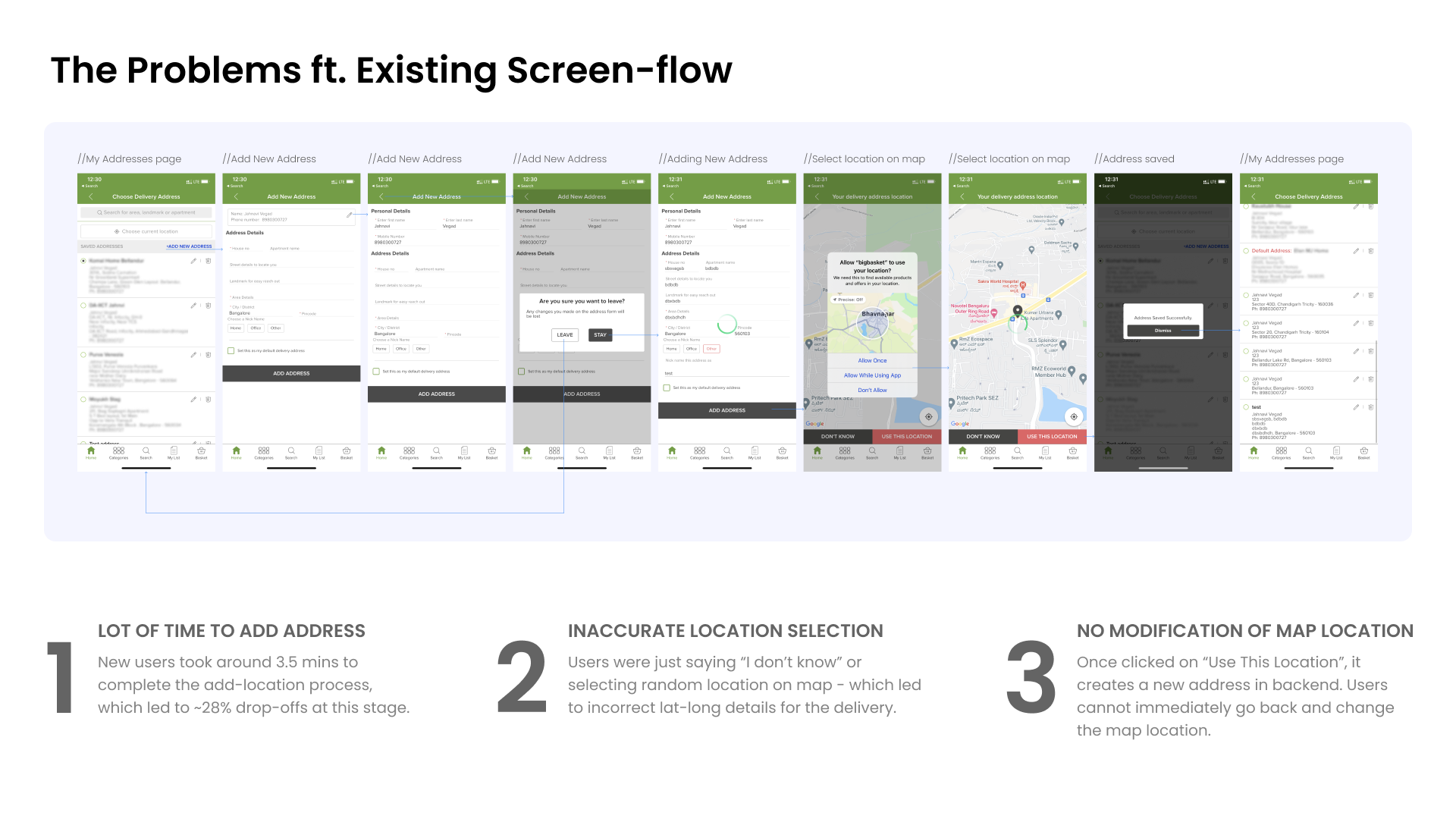
For a new user on an e-commerce app, if the first order gets delivered to a wrong address - it ruins the entire ordering experience. Also, the business ends up losing a potential user. For bigbasket, accurate delivery location is the single most important piece of information for user experience and business and this should be reflected in the app user experience.
How might we make the experience of adding addresses easier and faster for the new users on bigbasket app while ordering for the first time?
Outcome ⭐️
✔️ The time of adding a new address from 3.5 mins to <1 min.
✔️ ~7% reduction in drop-off rates of new visitors at this stage.
✔️ ~80% of new visitors successfully added new addresses
✔️ Estimated new visitor conversion rate is +15%.
My contribution
Product strategy UX Research Product design
The team
2 × product manager 1 × product designer 2 × engineers
Year
2022

.png)


Outcome
Within a month, we designed and released the new “add address” flow change for 5% of bigbasket app users. The new designs followed industry best-practices and smoothened out the user experience for new visitors, we could see a significant change in customer behaviours and a big drop in their frustration!! 🎉
I can't get tired of repeating the impact:
✔️ The time of adding a new address from 3.5 mins to <1 min.
✔️ ~7% reduction in drop-off rates of new visitors at this stage.
✔️ ~80% of new visitors successfully added new addresses
✔️ Estimated new visitor conversion rate is +15%.
Learnings & Future Improvements
📌 DO NOT ASK PEOPLE WHAT DO THEY WANT
When I asked users what was their pain-points in the existing address flow of bigbasket, they suggested list of cities to choose from to fill in the form. Only when I saw recordings of people adding addresses on the app, I got to know the reality.
📌 ALLOW USERS TO MAKE MISTAKES IN YOUR DESIGNS
Do not always look at the happy scenarios. Make your designs super flexible and responsive to everything the users do or don’t do. Create forgiving designs.
📌 FUTURE: INCLUDE ONBOARDING FOR NEWLY RELEASED FEATURES
After release, we have found out that the users are seeing a sudden change in the activity and some of them(~10%) are taking time to be comfortable with the new flow, maybe onboarding will help that.
[ Lastly, a big shoutout to the awesome PMs, engineers and design managers associated with this project; who make it possible for me to deliver such game-changing features every month and see bigbasket grow beyond just a grocery-app! :) ]